ggplot(data = <your data frame>, mapping = aes(x = <variable to be mapped to axis x>)) +
geom_<geometry>() Data visualization
Brainstorming
- Why do we visualize data?
- What elements does a good graph contain?
- How are these elements called?
Basic ggplot() syntax
- Function
ggplot()takes the data frame as an argument.
- argument
aes()serves to map aesthetics (axis x and y, colors etc.) to different variables from your data frame.
- Functions with
geom_prefix are geometries, ie. types of plots to draw. You can set specific arguments such as the color or shape here.
- Note the
+after each layer of the ggplot
Geoms for one variable:
geom_histogram()geom_density()geom_bar()
Plots for one variable
Histogram
- Distribution of values of a quantitative variable.
Distribution of dart point weights.
ggplot(data = df_dartpoints, mapping =  aes(x = Length)) +
   geom_histogram()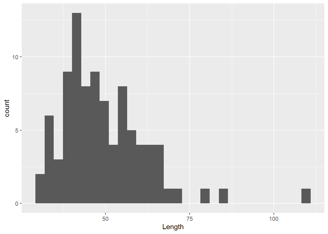
Histogram
- note that you don’t need to write arguments
data =andmapping =
ggplot(df_dartpoints, aes(x = Length)) +
  geom_histogram(binwidth = 5)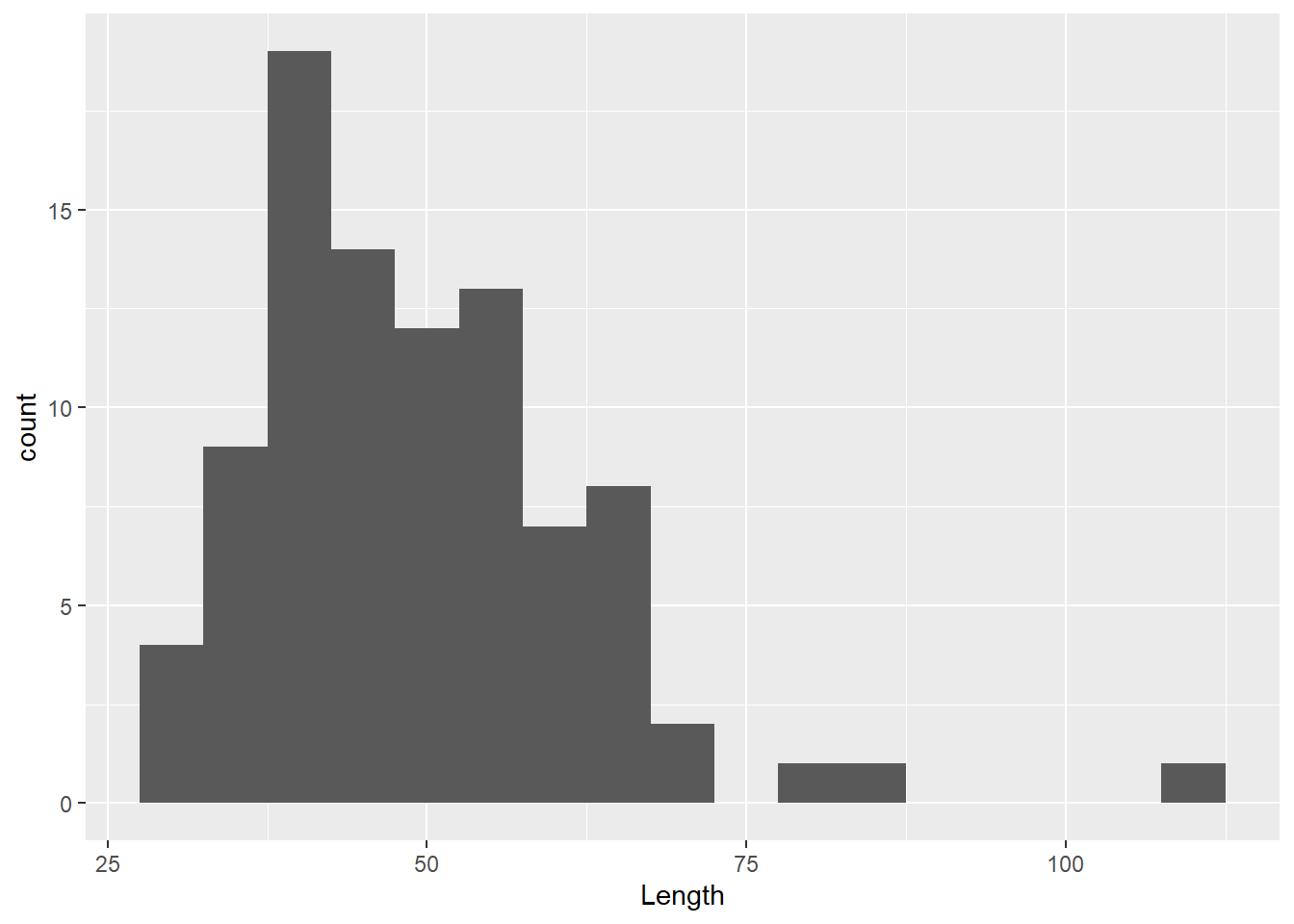
Histogram
ggplot(df_dartpoints, aes(x = Length))+
  geom_histogram(binwidth = 5, color = "black")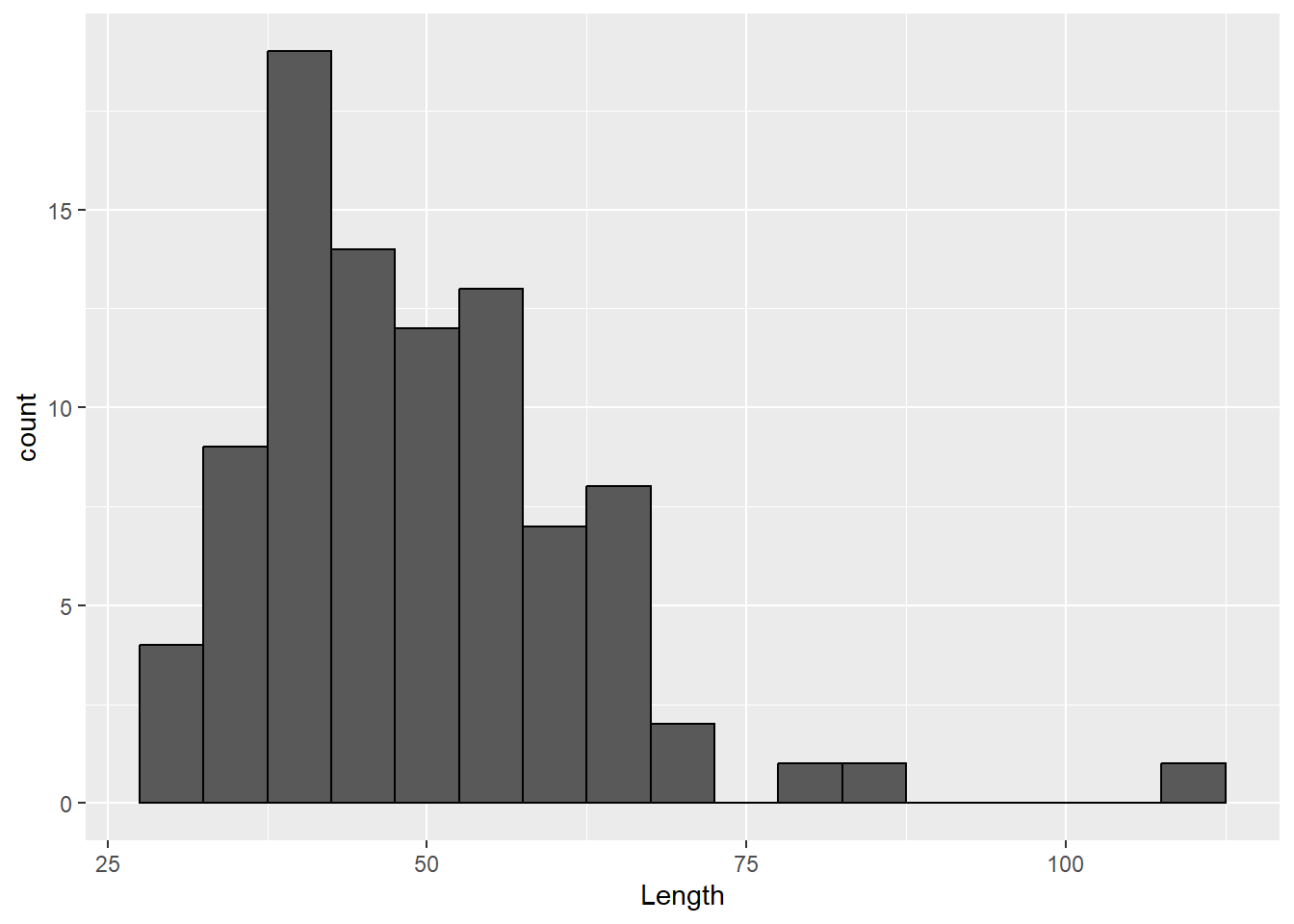
Histogram
ggplot(df_dartpoints, aes(x = Length)) +
  geom_histogram(binwidth = 5, color = "black", fill = "white")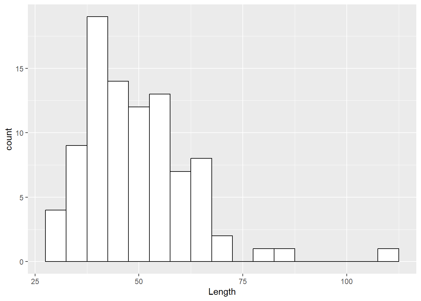
Labels
ggplot(df_dartpoints, aes(x = Length)) +
  geom_histogram(binwidth = 5, color = "black", fill = "white") +
  labs(x = "Length (cm)", y = "Count")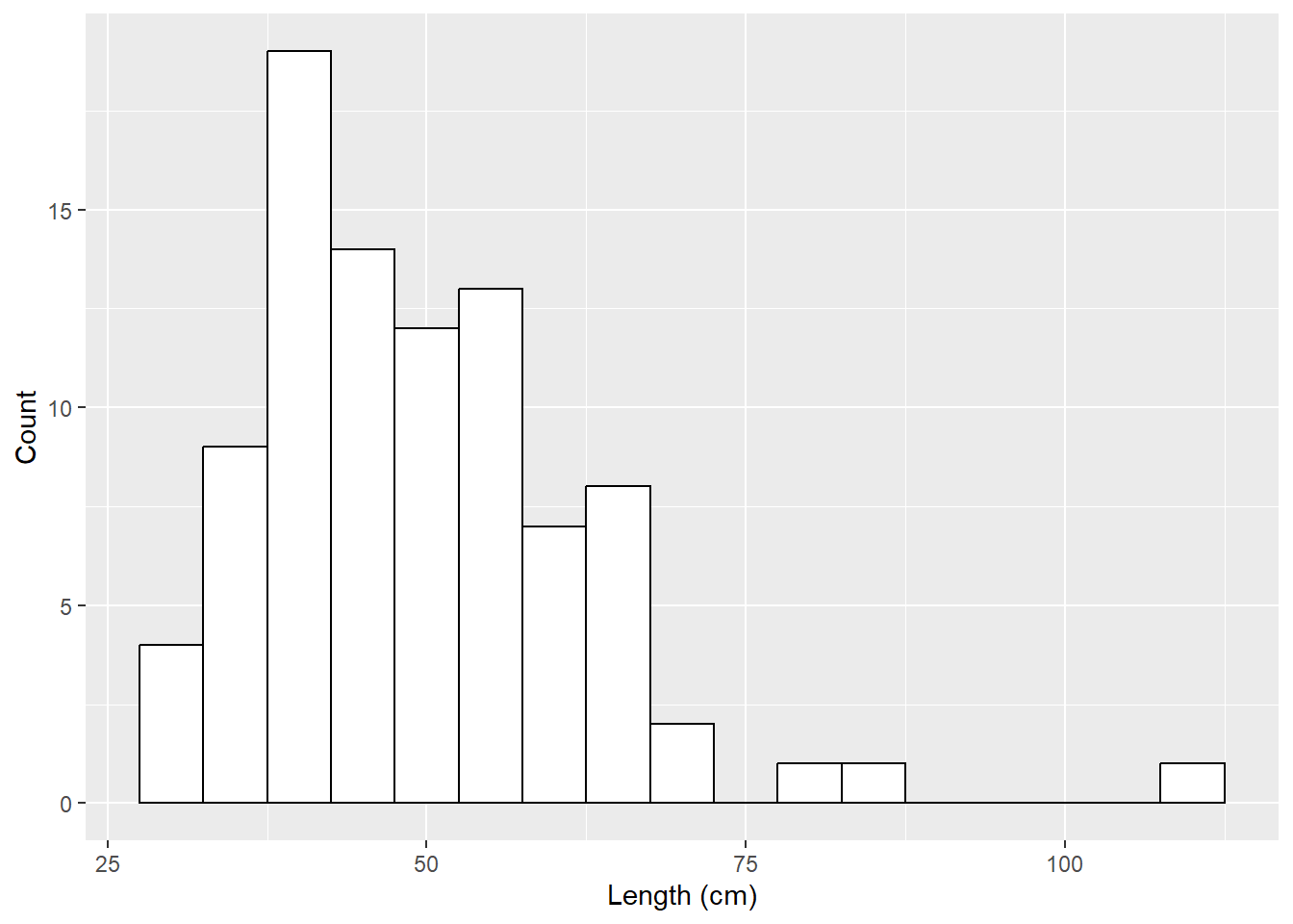
Labels
ggplot(df_dartpoints, aes(x = Length)) +
  geom_histogram(binwidth = 5, color = "black", fill = "white") +
  labs(x = "Length (cm)", y = "Count",
       title = "Histogram of dart point lengths")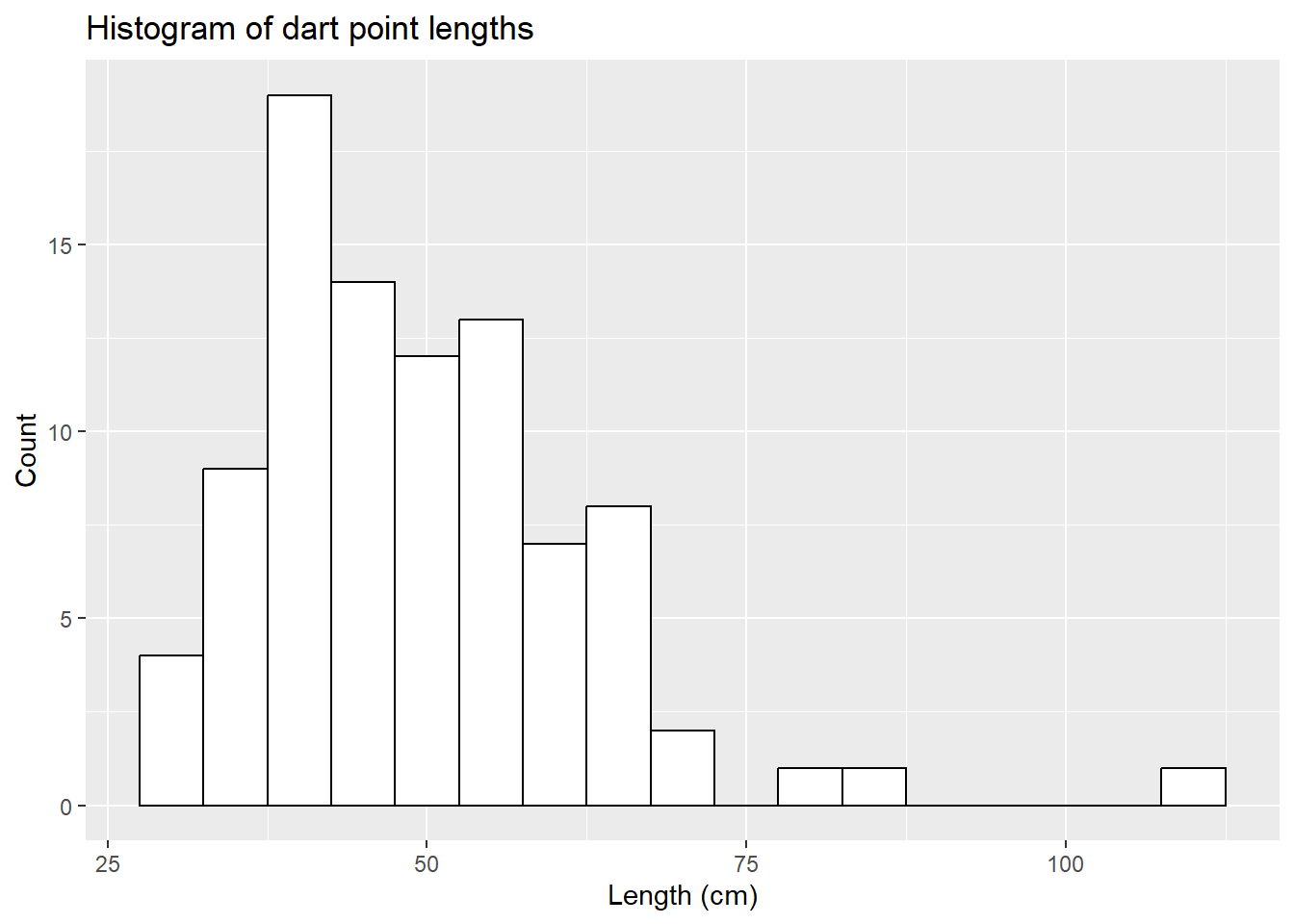
Labels
ggplot(df_dartpoints, aes(x = Length))+
  geom_histogram(binwidth = 5, color = "black", fill = "white") +
  labs(x = "Length (cm)", y = "Count",
       title = "Histogram of dart point lengths",
       caption = "Data adapted from archdata R package, Carlson 2017")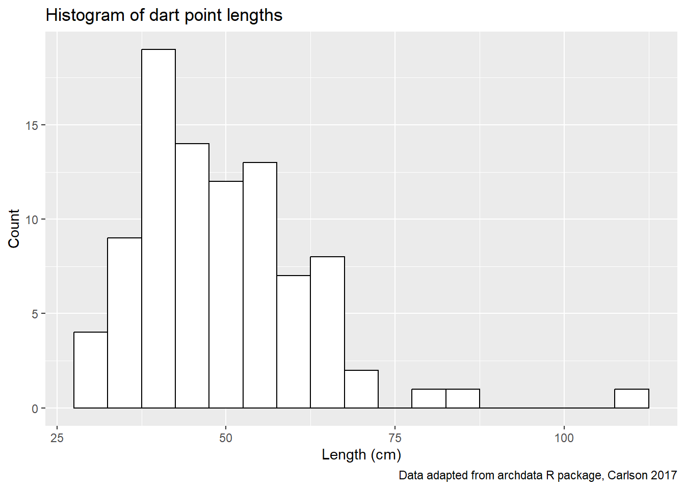
Density plot
- Distribution of values of a quantitative variable.
Distribution of dart point weights.
ggplot(df_dartpoints, aes(x = Length)) +
  geom_density()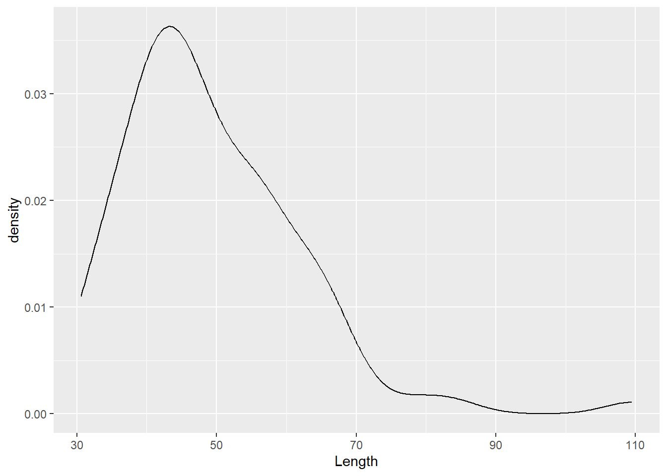
Density plot - setting the color
ggplot(df_dartpoints, aes(x = Length)) +
  geom_density(color = "red")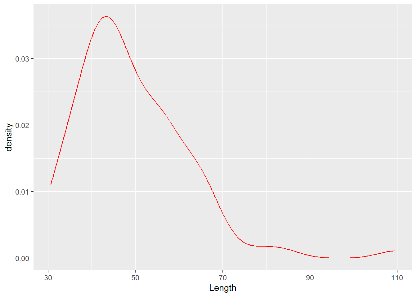
Density plot - mapping variables by color
ggplot(df_dartpoints, aes(x = Length, color = Name)) +
  geom_density()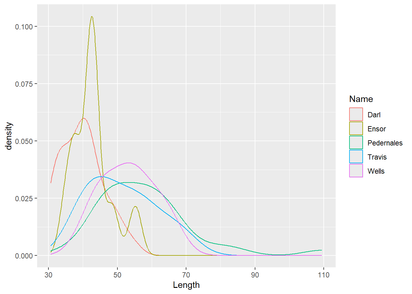
Density plot
ggplot(df_dartpoints, aes(x = Length, color = Name, fill = Name)) +
  geom_density()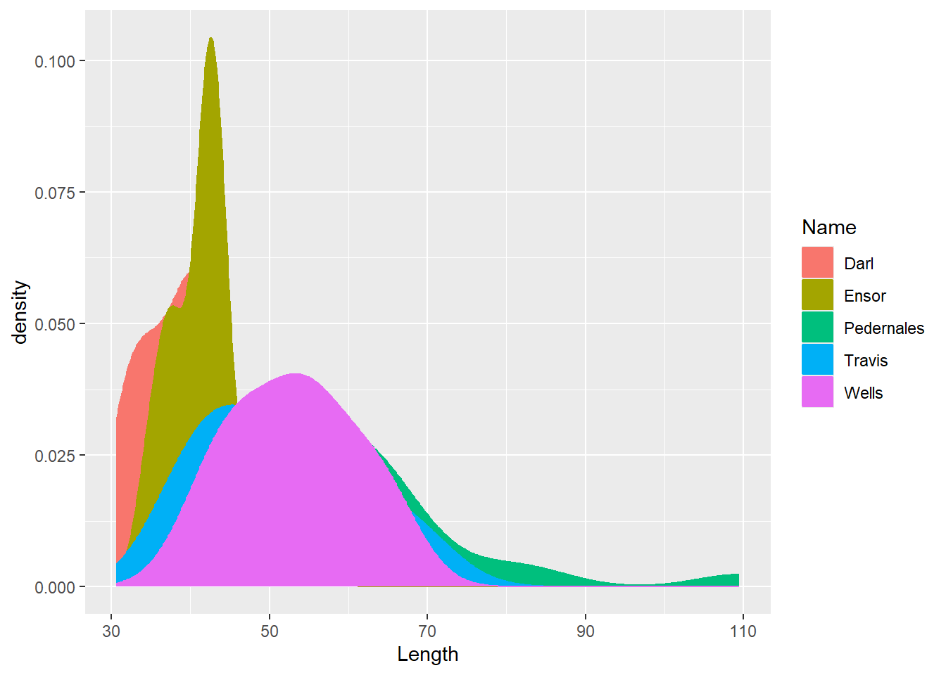
Density plot
ggplot(df_dartpoints, aes(x = Length, color = Name, fill = Name)) +
  geom_density(alpha = 0.4)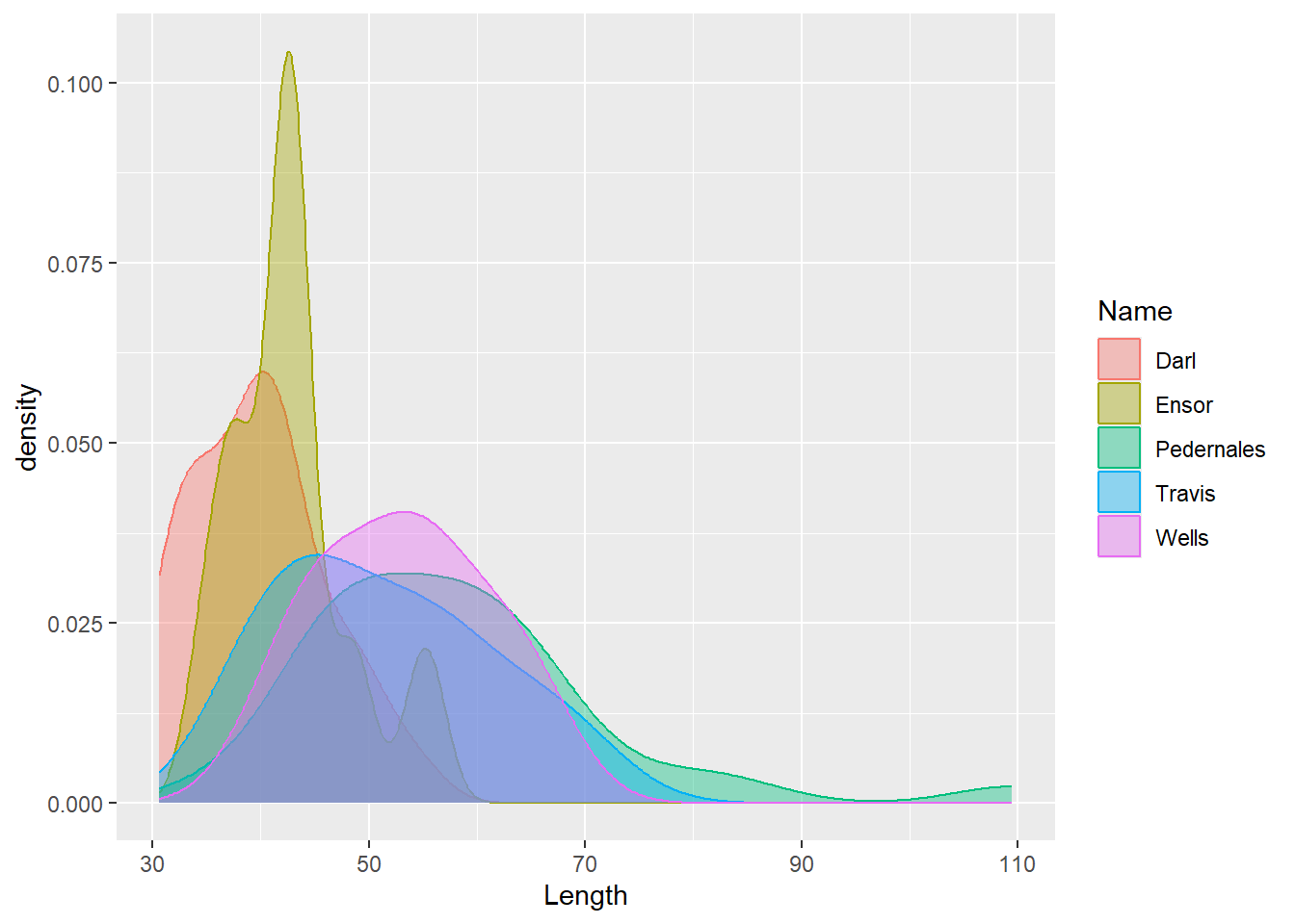
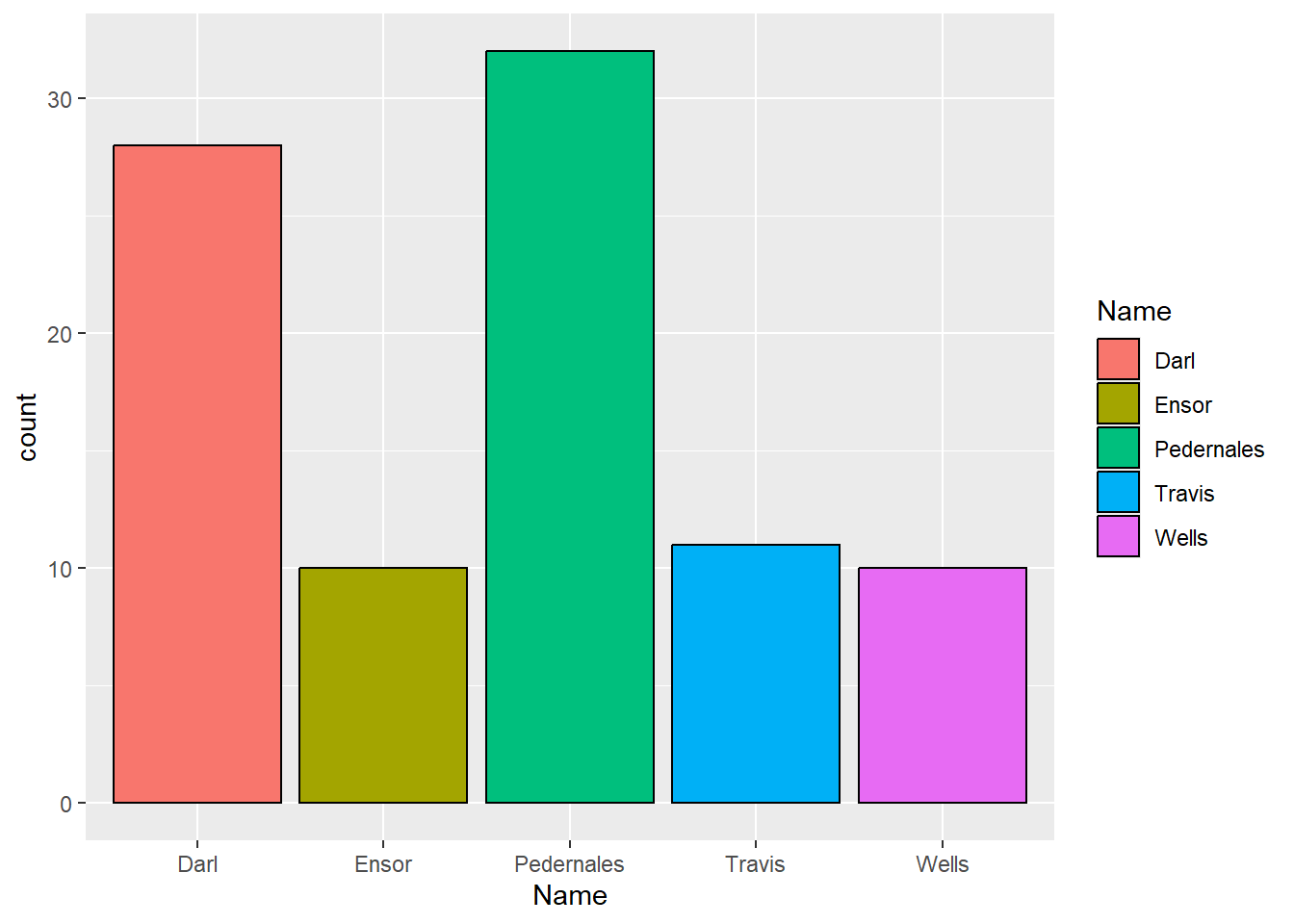
Bar chart
- Distribution of values of a qualitative variable.
Distribution of types of dart points.
ggplot(data = df_dartpoints, aes(x = Name)) +
  geom_bar()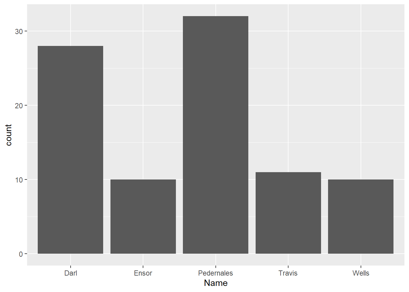
Bar chart
ggplot(data = df_dartpoints, aes(x = Name, color = Name)) +
  geom_bar()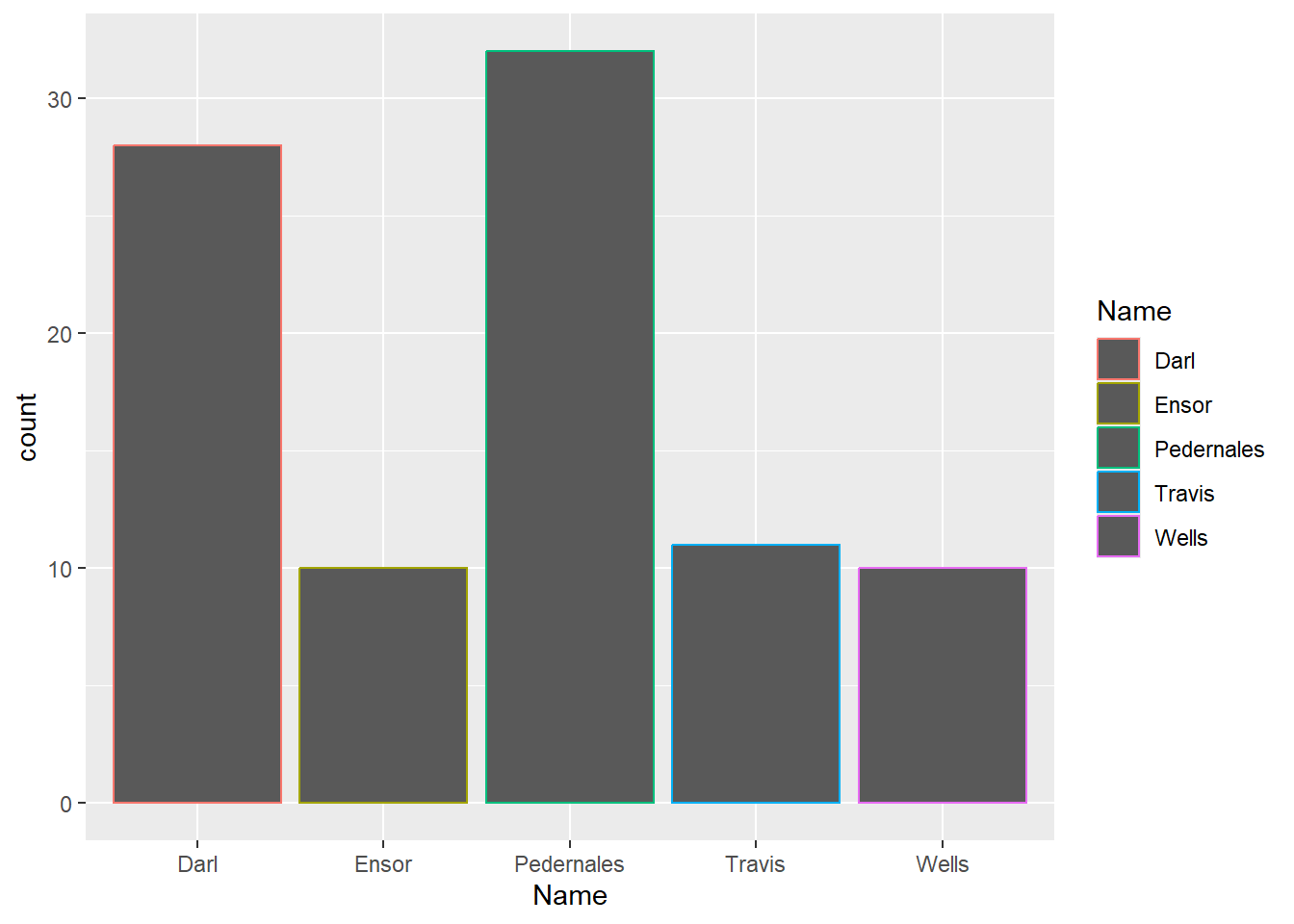
Bar chart
ggplot(data = df_dartpoints, aes(x = Name, color = Name, fill = Name)) +
  geom_bar()
Bar chart
- notice here the difference between setting color of our choice and mapping color based on one variable
ggplot(data = df_dartpoints, aes(x = Name, fill = Name)) +
  geom_bar(color = "black")