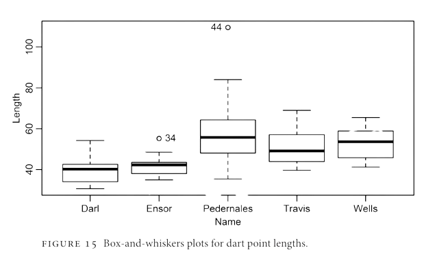
max(dartpoints$Weight) -min(dartpoints$Weight) # or range(dartpoints$Weight)
[1] 26.5
sd(dartpoints$Weight)
[1] 4.207088
IQR(dartpoints$Weight)
[1] 5.5
summary(dartpoints$Weight)
   Min. 1st Qu.  Median    Mean 3rd Qu.    Max.
  2.300   4.550   6.800   7.643  10.050  28.800
Brainstorming
Why do we visualize data?
What elements does a good graph contain?
How are these elements called?
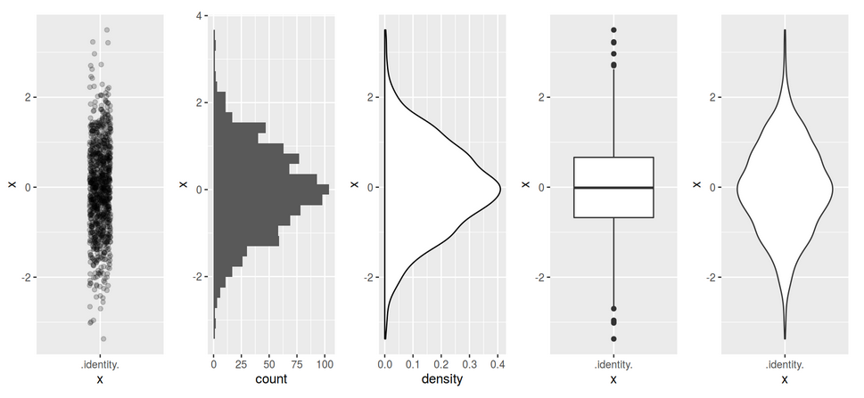
Boxplots from Carlson 2017
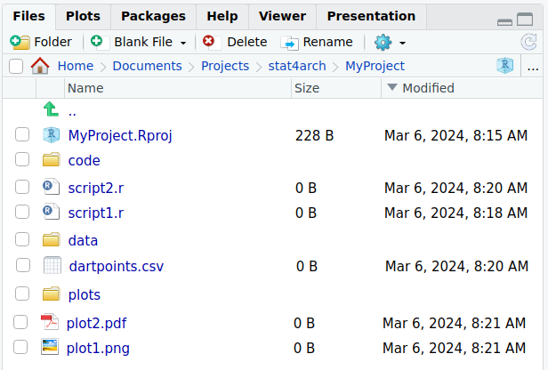
Plots for one variable
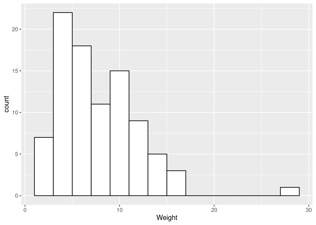
Histogram
Distribution of values of a quantitative variable.
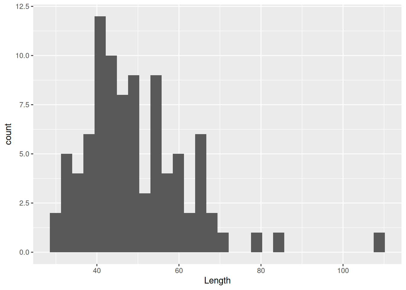
Distribution of dart point weights.
Histogram
Distribution of values of a quantitative variable.
Distribution of dart point weights, one column (bin) equals 2 g.
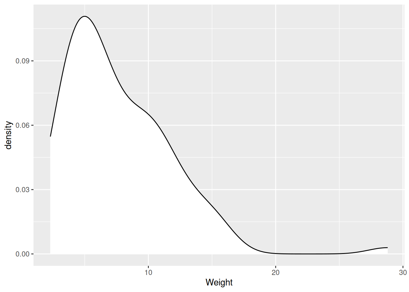
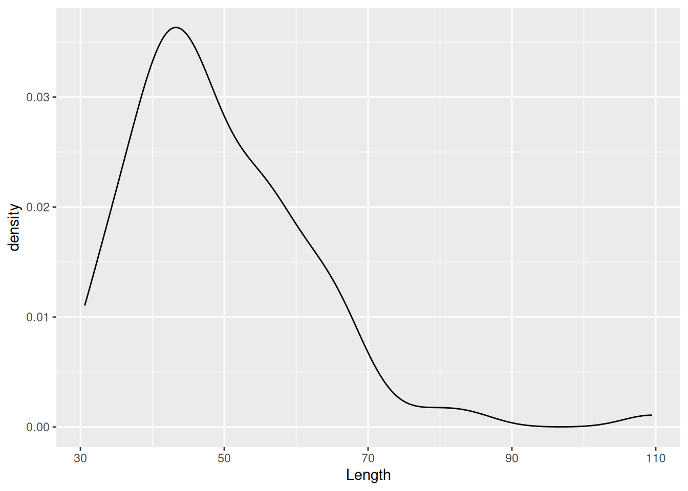
Density plot
Distribution of values of a quantitative variable.
Distribution of dart point weights.
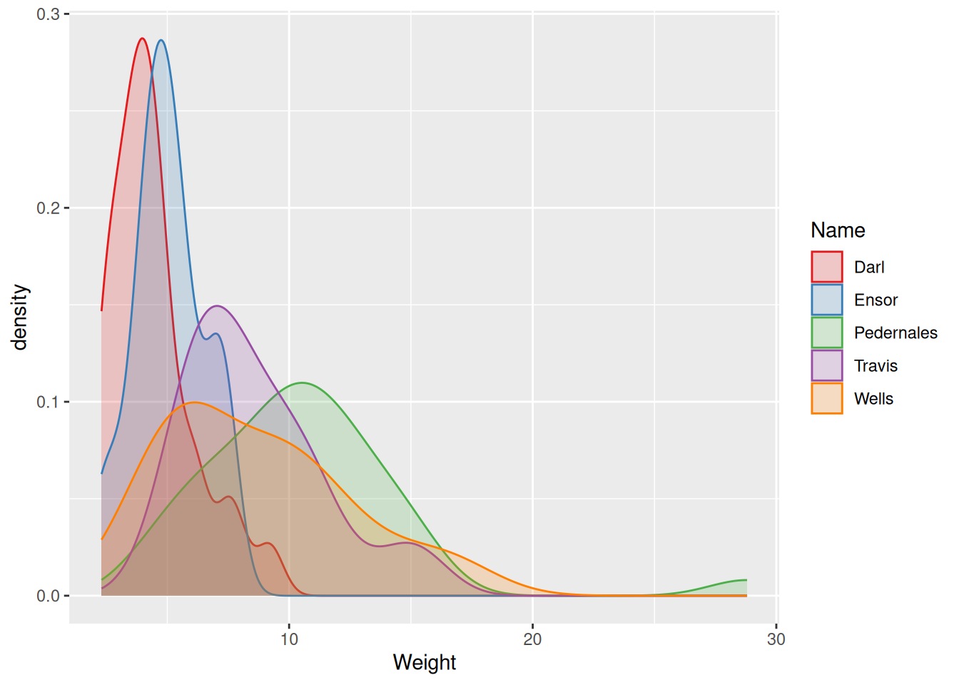
Density plot
Distribution of values of a quantitative variable, great for comparisons.
Distribution of different types of dart points by weight.
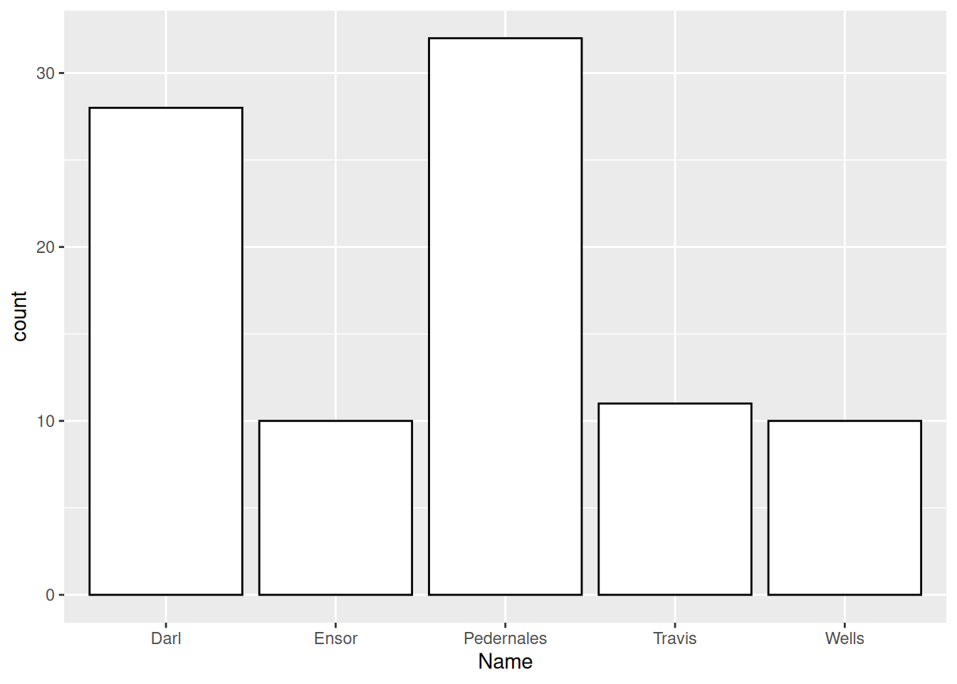
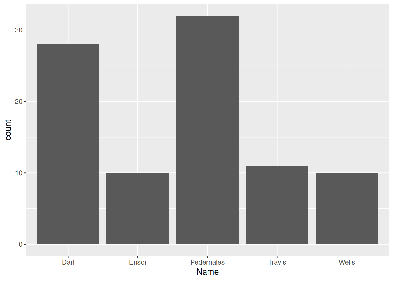
Bar chart
Distribution of values of a qualitative variable.
Distribution of types of dart points.
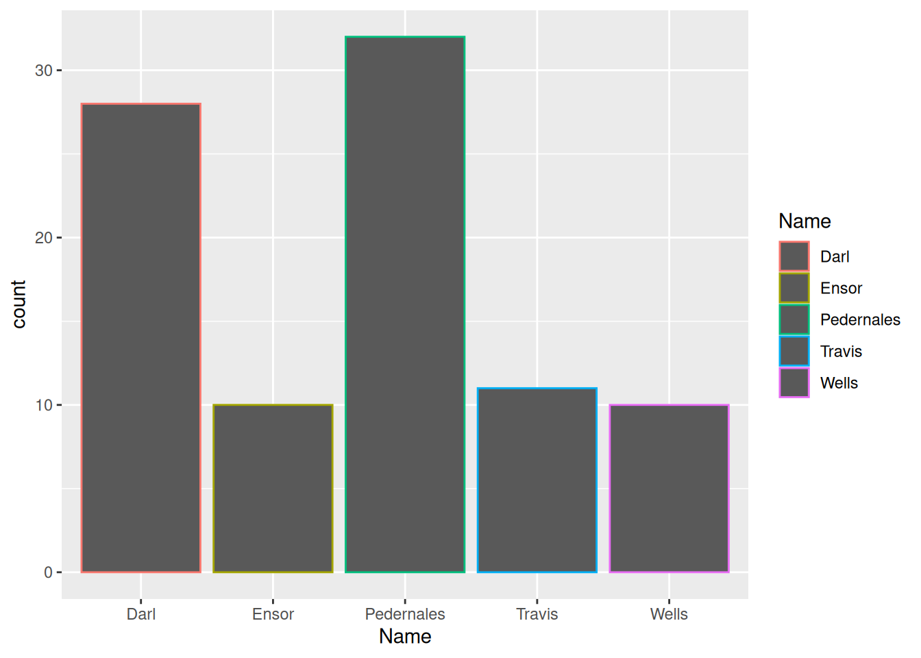
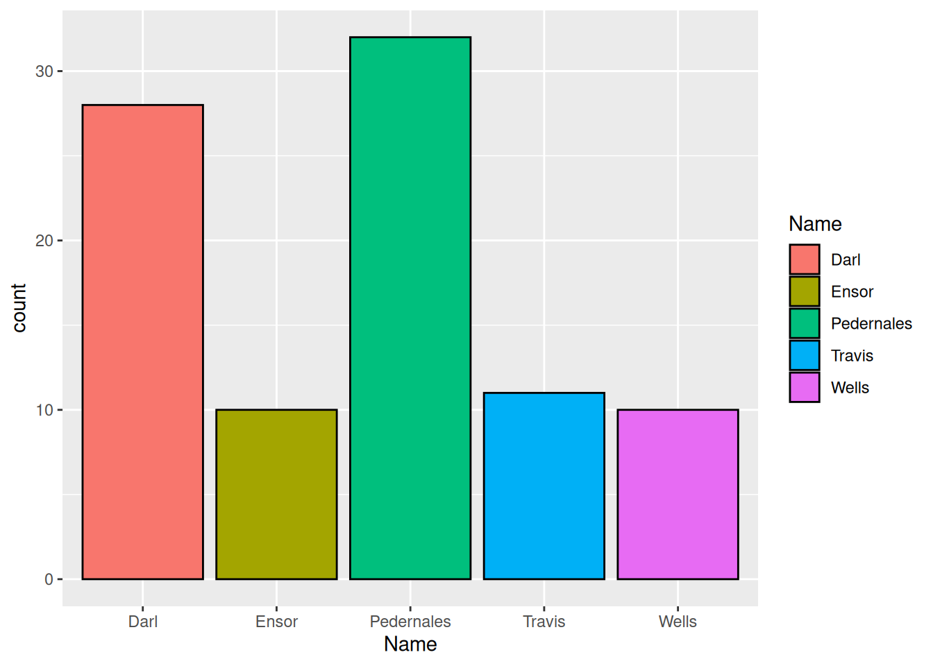
Plots in ggplot2 package
1install.packages("ggplot2")2library(ggplot2)3ggplot(data =<your data frame>) +4aes(x =<variable to be mapped to axis x>) +5 geom_<geometry>()
1
Install the package ggplot2, do this only once.
2
Load the package from the library of installed packages, do this for every new script.
(Calls to library() function are usually written at the top of the script.)
3
Function ggplot() takes the data frame as an argument.
4
Function aes() serves to map aesthetics (axis x and y, colors etc.) to different variables from your data frame.
5
Functons with geom_ prefix are geometries, ie. types of plots to draw.
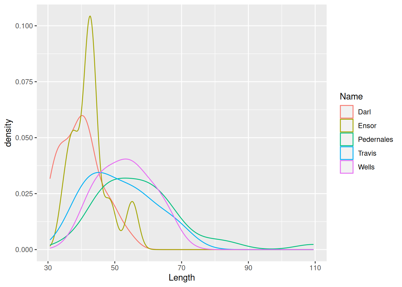
ggplot(dartpoints) +aes(x = Length, color = Name) +geom_density()
Density plot
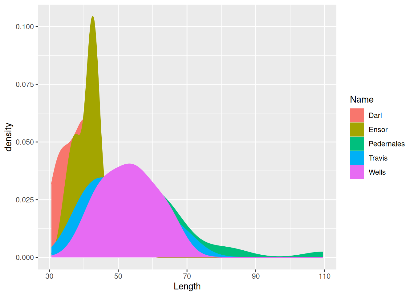
ggplot(dartpoints) +aes(x = Length, color = Name, fill = Name) +geom_density()
Density plot
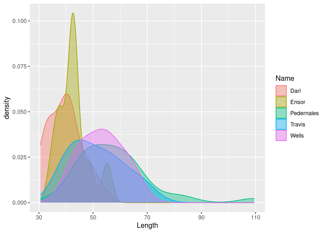
ggplot(dartpoints) +aes(x = Length, color = Name, fill = Name) +geom_density(alpha =0.4)
Labels
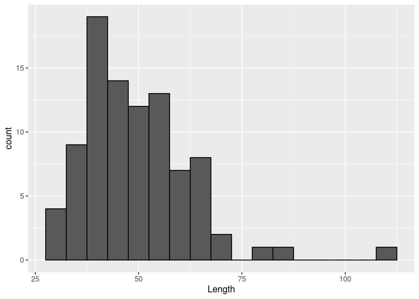
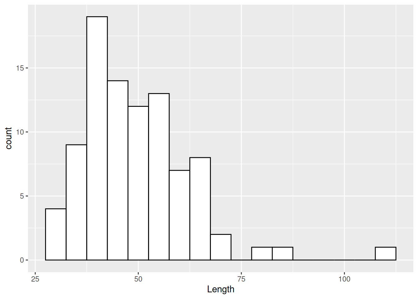
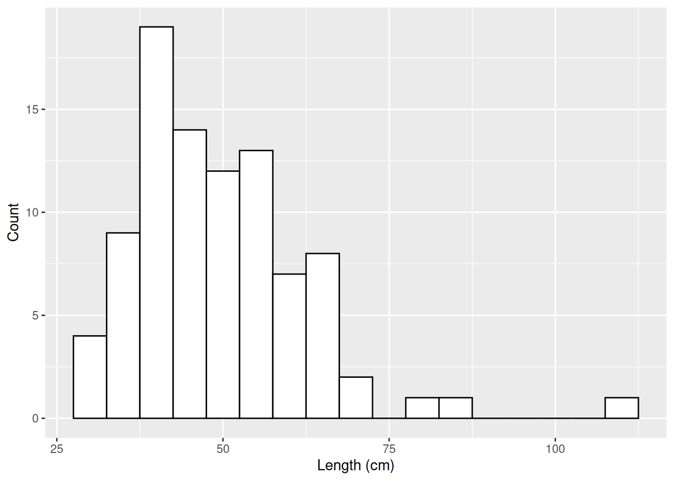
ggplot(dartpoints) +aes(x = Length) +geom_histogram(binwidth =5, color ="black", fill ="white")
Labels
ggplot(dartpoints) +aes(x = Length) +geom_histogram(binwidth =5, color ="black", fill ="white") +labs(x ="Length (cm)", y ="Count")
Labels
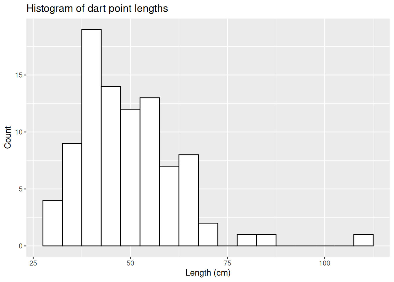
ggplot(dartpoints) +aes(x = Length) +geom_histogram(binwidth =5, color ="black", fill ="white") +labs(x ="Length (cm)", y ="Count",title ="Histogram of dart point lengths")
Labels
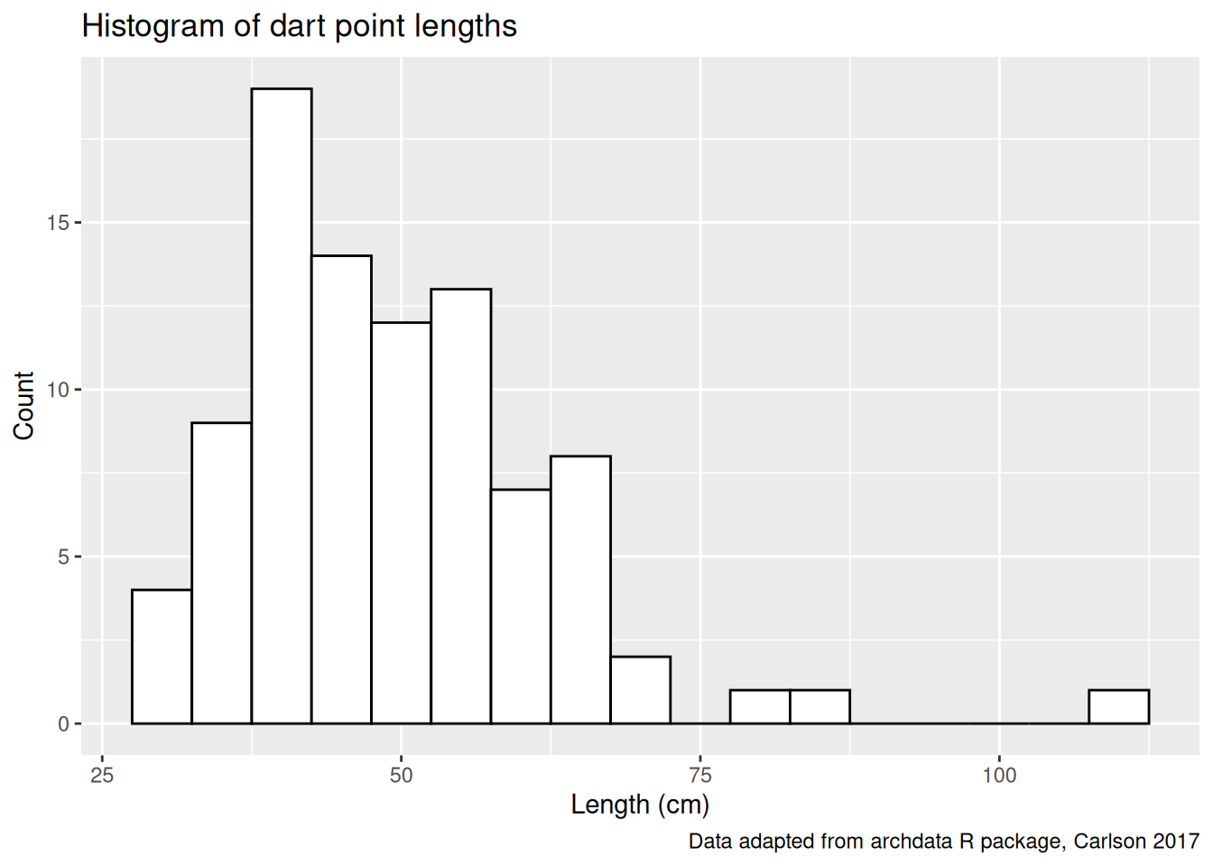
ggplot(dartpoints) +aes(x = Length) +geom_histogram(binwidth =5, color ="black", fill ="white") +labs(x ="Length (cm)", y ="Count",title ="Histogram of dart point lengths", caption ="Data adapted from archdata R package, Carlson 2017")
Exercises
Assignments
Read Make a plot chapter in Data Visualization book by K. J. Healy.