Summaries and visualization of relationships
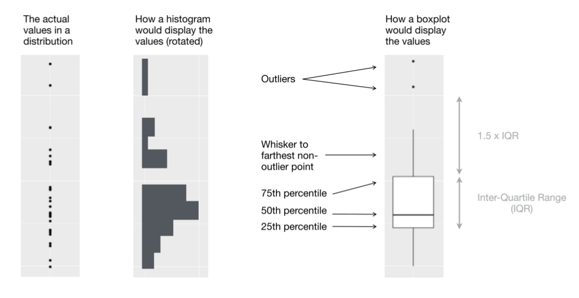
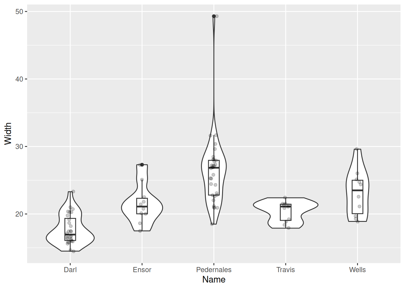
Boxplot
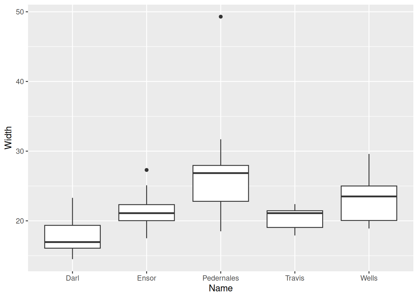
Boxplot
Also box and whisker plot, displays five-number summary.
Violin plot
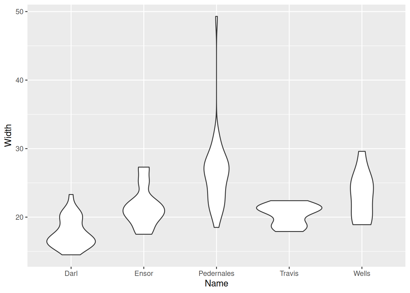
Violin plot
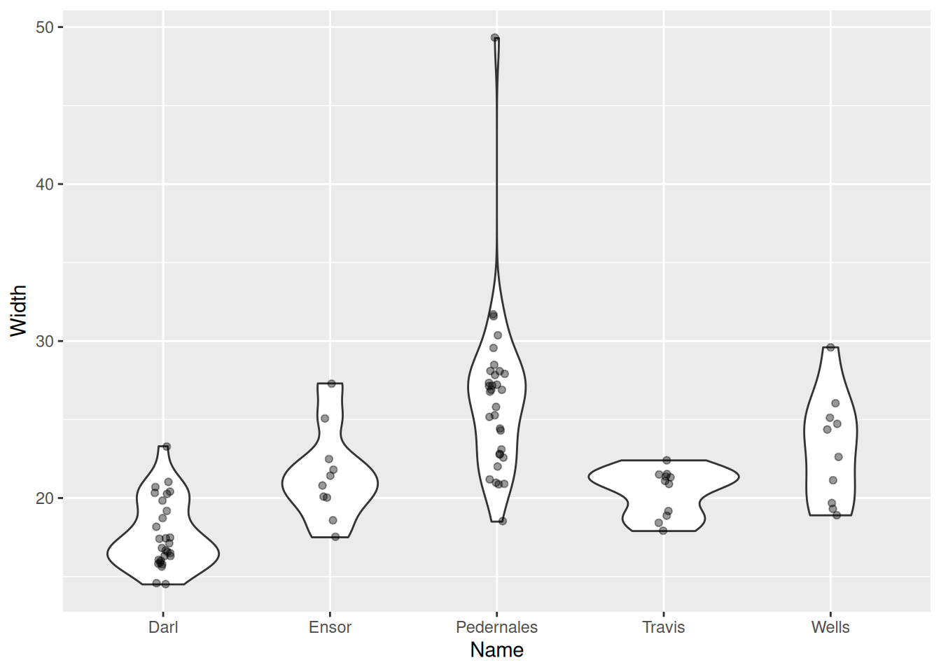
Violin plot
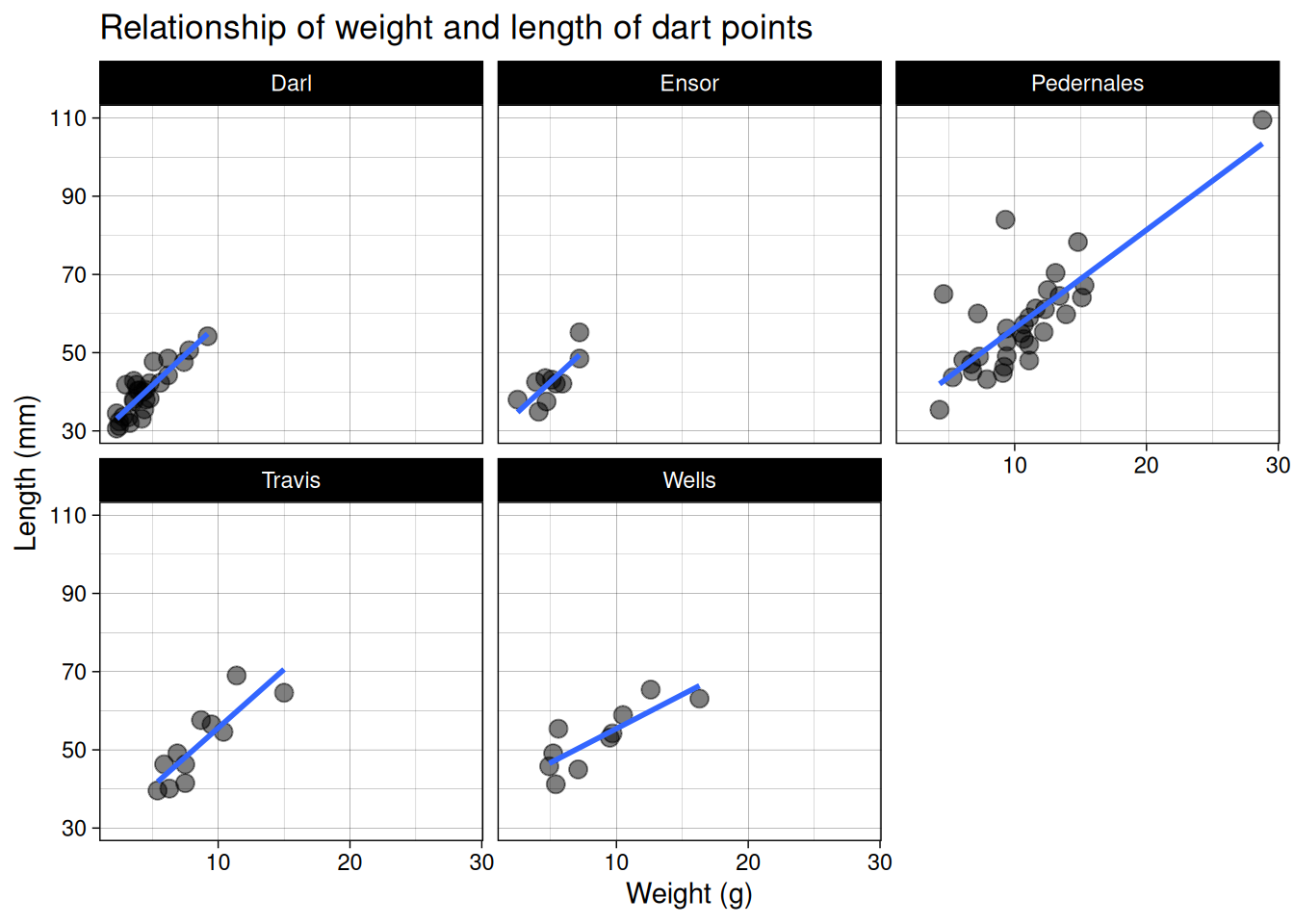
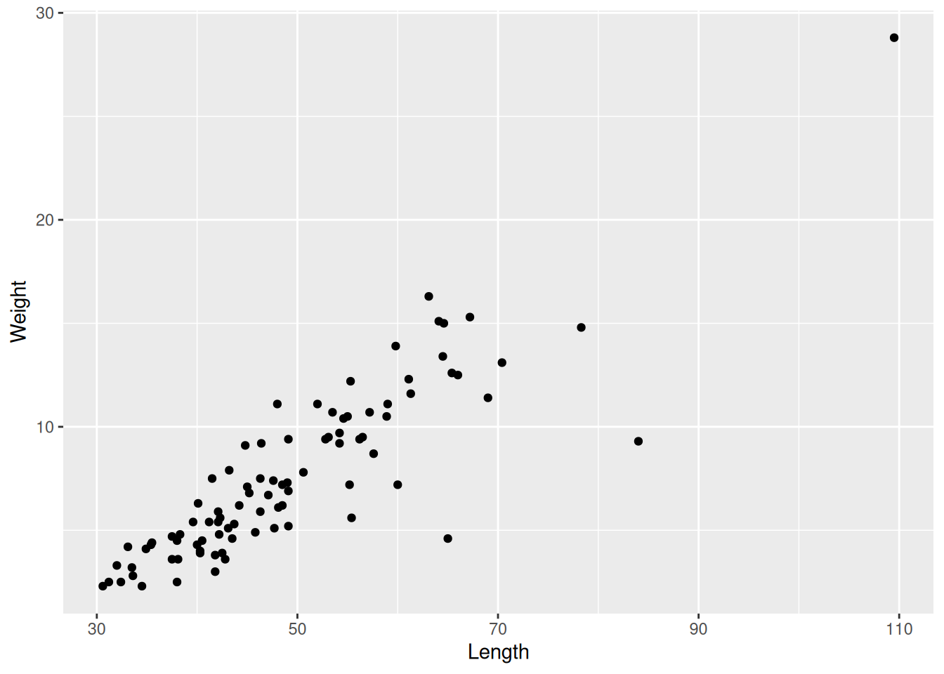
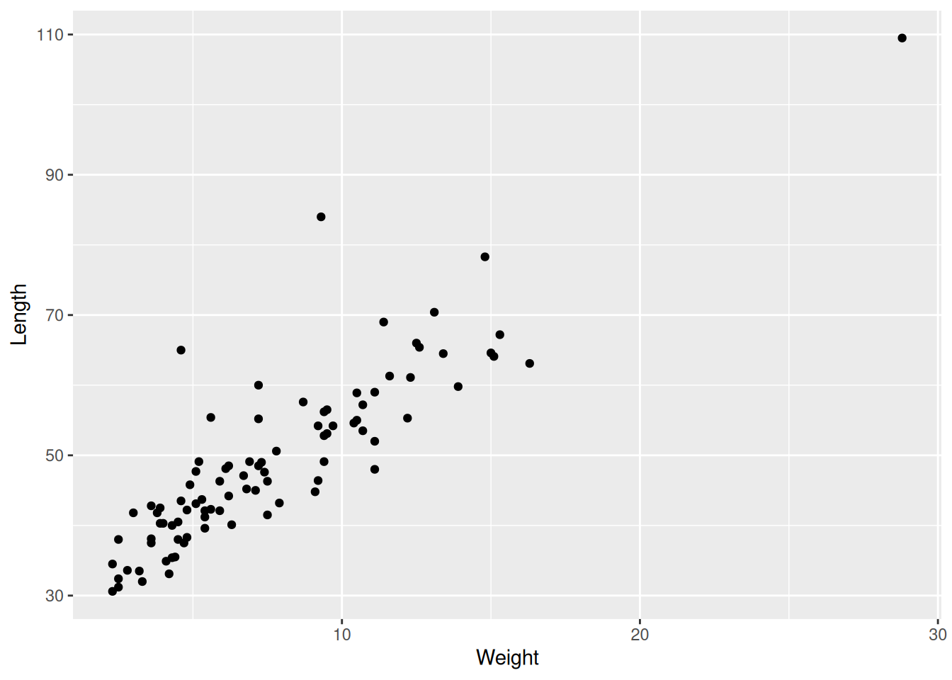
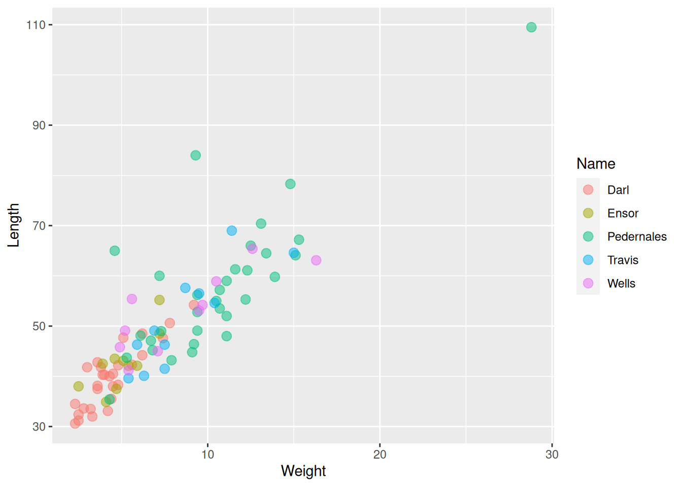
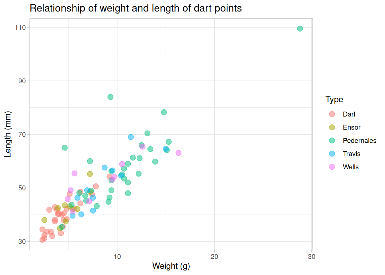
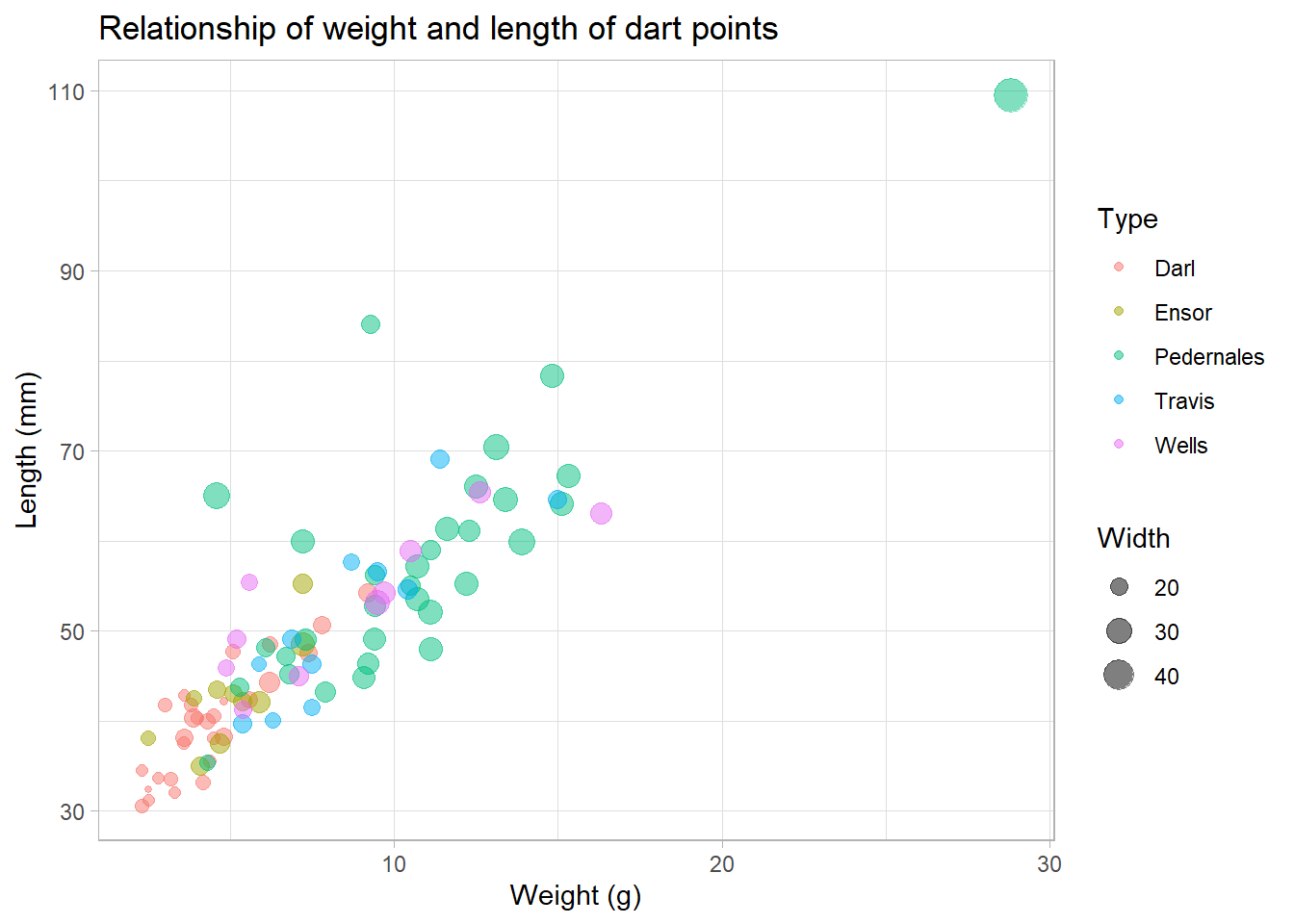
Scatter plot
- Plot displying two continuous variables, x and y.
- x axis: explanatory variable, independent, predictor.
- y axis: dependent variable, response.
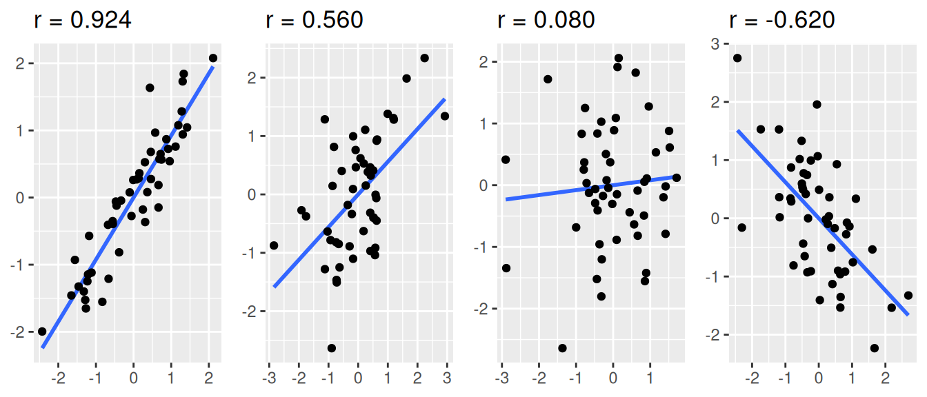
Correlation examples
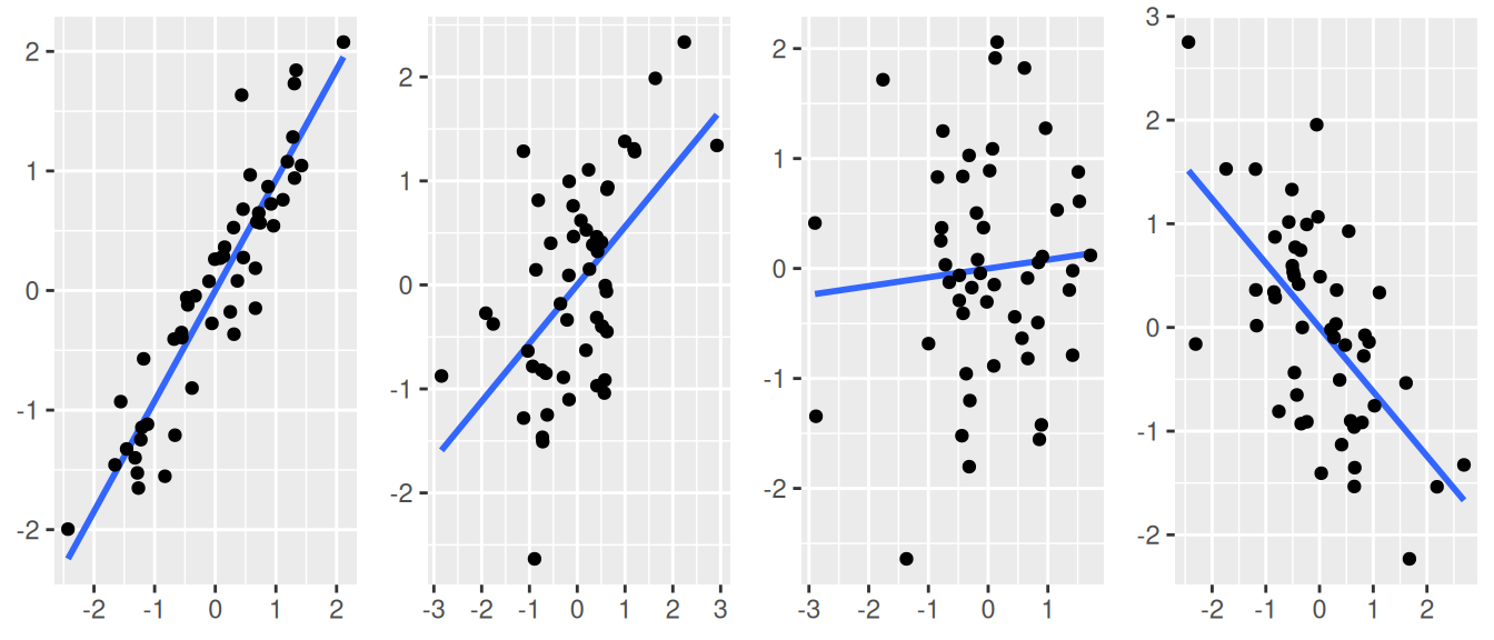
Correlation examples
Scatter plots
Scatter plots
Scatter plots
Scatter plots
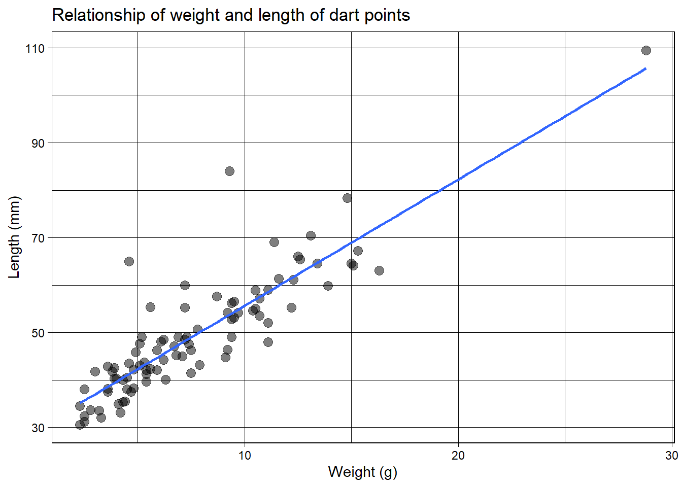
Trends
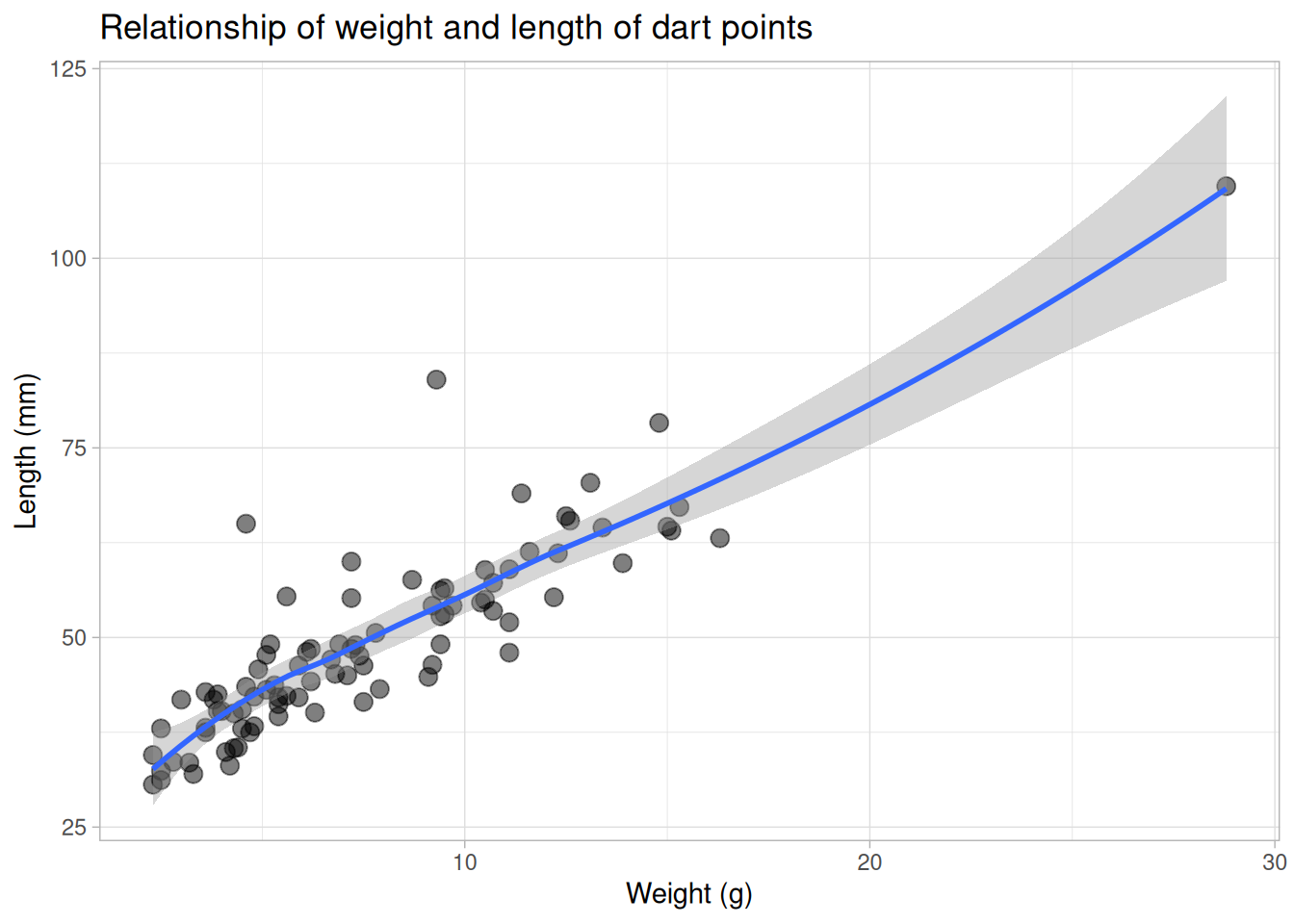
Trends
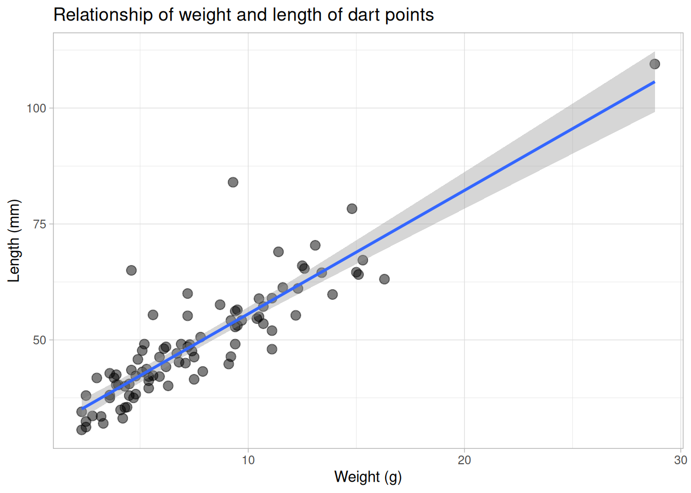
Trends
Small multiples